

Film: Barton Fink (The Coen Bros., USA, 1991)
Designer: Concept Arts
This poster is so ballsy, I love it. It perfectly sums up the absurdity of the Coen brothers' film. First we have John Turturro's face, that deer in the headlights expression, comically accented (as if he needed any help) by his Harold Lloyd glasses and Brillo pad hair (Eraserhead, anyone?). Then we have the mosquito, a bizarre touch those unfamiliar with the film would be baffled by. What's the significance? It's intriguing. The tagline seeks to mediate the eccentricty: "There's only one thing stranger than what's going on in his head. What's going on outside." The focus on Turturro's face, his forehead (his brain) and the mosquito (sucking out what's inside) make some kind of sense now. The whole poster emphasizes the film's main theme of interiority, head space, and the madness that comes from living inside yourself.


Is there a more iconic poster of the 1990s? The Pulp Fiction poster is a perfect pastiche of a trashy '40s-era dime novel, from the bent and torn edges to the femme fatale on the cover. The design, like the film, is playfully self-conscious and self-referential (Uma Thurman is reading a pulp novel on the cover of Pulp Fiction--cutesy). I also like that this image is never seen in the film and really has nothing to do with the plot or the characters, merely the film's generic referent. It's kind of the quintessential postmodern document, a thing that references a thing that references many other things for no consequential reason at all.
This poster is so ballsy, I love it. It perfectly sums up the absurdity of the Coen brothers' film. First we have John Turturro's face, that deer in the headlights expression, comically accented (as if he needed any help) by his Harold Lloyd glasses and Brillo pad hair (Eraserhead, anyone?). Then we have the mosquito, a bizarre touch those unfamiliar with the film would be baffled by. What's the significance? It's intriguing. The tagline seeks to mediate the eccentricty: "There's only one thing stranger than what's going on in his head. What's going on outside." The focus on Turturro's face, his forehead (his brain) and the mosquito (sucking out what's inside) make some kind of sense now. The whole poster emphasizes the film's main theme of interiority, head space, and the madness that comes from living inside yourself.

Film: Unforgiven (Clint Eastwood, USA, 1992)
Designer: Bill Gold, USA
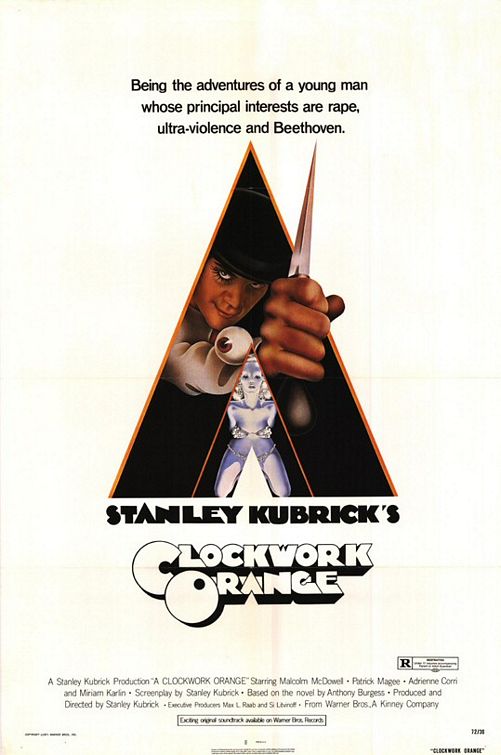
I highly suggest you click the link for Bill Gold, above. The man is a legend. Besides designing posters for every Clint Eastwood film from Dirty Harry to Mystic River, he also designed Cool Hand Luke, A Clockwork Orange, Marathon Man, The Untouchables...the list goes on and on. This teaser poster for Unforgiven is perhaps his masterpiece. It's everything a teaser poster should be. The build-up around the film was tremendous: Clint is back in a Western, his first since 1985's Pale Rider. It was supposed to his last Western (it still is), the anti-violence Western, the elegiac Western, the final nail in the coffin. With his back to us, Eastwood embodies "The End." Unlike the poster for The Outlaw Josey Wales featured last time, Clint still has a big gun, but the whole mood is more subdued, more reserved, mournful. The power of his iconic Western silhouette is what sells the poster; the design hinges on our collective understanding of the man, his screen persona and body of work. Like John Wayne framed in the doorway at the end of John Ford's The Searchers, it's an homage to an indelible cultural image.
I highly suggest you click the link for Bill Gold, above. The man is a legend. Besides designing posters for every Clint Eastwood film from Dirty Harry to Mystic River, he also designed Cool Hand Luke, A Clockwork Orange, Marathon Man, The Untouchables...the list goes on and on. This teaser poster for Unforgiven is perhaps his masterpiece. It's everything a teaser poster should be. The build-up around the film was tremendous: Clint is back in a Western, his first since 1985's Pale Rider. It was supposed to his last Western (it still is), the anti-violence Western, the elegiac Western, the final nail in the coffin. With his back to us, Eastwood embodies "The End." Unlike the poster for The Outlaw Josey Wales featured last time, Clint still has a big gun, but the whole mood is more subdued, more reserved, mournful. The power of his iconic Western silhouette is what sells the poster; the design hinges on our collective understanding of the man, his screen persona and body of work. Like John Wayne framed in the doorway at the end of John Ford's The Searchers, it's an homage to an indelible cultural image.

Film: Reservoir Dogs (Quentin Tarantino, USA, 1992)
Designer: Unknown
Although the most famous image from this film is the shot of the Dogs strutting down the street to "Little Green Bag" in their professional suits and black ties (parodied here), the second-string imagine in the film's campaign were these wavvy silhouettes with colored shadows and the red paw print. The red is obviously blood, employed here, as in the film, as the unspoken ninth member of the Reservoir Dog heist squad. This version of the poster is for fans of the film because if you haven't seen it, the colors aren't yet significant. The most popular poster is equally powerful but more traditional in its portrayal of violence. The violence in this more colorful version is implied and satisfying for those who know what the red paw print references.
Although the most famous image from this film is the shot of the Dogs strutting down the street to "Little Green Bag" in their professional suits and black ties (parodied here), the second-string imagine in the film's campaign were these wavvy silhouettes with colored shadows and the red paw print. The red is obviously blood, employed here, as in the film, as the unspoken ninth member of the Reservoir Dog heist squad. This version of the poster is for fans of the film because if you haven't seen it, the colors aren't yet significant. The most popular poster is equally powerful but more traditional in its portrayal of violence. The violence in this more colorful version is implied and satisfying for those who know what the red paw print references.

Film: Pulp Fiction (Quentin Tarantino, USA, 1994)
Designer: Indika Entertainment Advertising, USA
Is there a more iconic poster of the 1990s? The Pulp Fiction poster is a perfect pastiche of a trashy '40s-era dime novel, from the bent and torn edges to the femme fatale on the cover. The design, like the film, is playfully self-conscious and self-referential (Uma Thurman is reading a pulp novel on the cover of Pulp Fiction--cutesy). I also like that this image is never seen in the film and really has nothing to do with the plot or the characters, merely the film's generic referent. It's kind of the quintessential postmodern document, a thing that references a thing that references many other things for no consequential reason at all.

Film: Basquiat (Julian Schnabel, USA, 1996)
Designer: Unknown
Basquiat is the story of street artist turned art world sensation Jean-Michel Basquiat, his meteoric rise, fall and death of a drug overdose at the age of twenty-seven. The poster is a photograph of actor Jeffrey Wright as Basquiat which has been painted over in the style of Basquiat and contemporary Julian Schnabel (also the director). The typography as an unique, hand-painted intimacy and refers to Basquiat's beginning as a graffiti artist. My favorite touches are the visible brushstrokes which gives the whole piece a more painterly feeling.


In a cheery design that's been copied numerous times, this poster launched a mini design revolution along with Steve Carell's career. But it really only works if the guy on the poster is a relative unknown like Carell was at the time and if the tagline and title are sufficiently goofy. The contrasting joy of Carell's expression coupled with the big, fat "Virgin" (accented by the "Better late than never" tag) is the crux of the humor in this poster. And it is funny. And if the poster makes you laugh, that bodes well for the movie. Although the poster does commit the cardinal movie poster sin of that insidious blue/orange color palette, it's an engaging enough design to forgive.


Another good example of how an alternate design can trump the dominant one. The main poster for this film (and the one used on the DVD jacket) was this one: a stylish and well-constructed, if traditional design. It features the films' two leads, Russell Crowe and Christian Bale and plots them on opposite sides of the frame. It's not a bad poster by any means, but it's got nothing on this beautiful sepia teaser. Look at the textures on this thing, the little design flourishes, the unusual composition of text. The title resembles kinetic typography in static form. In fact the whole poster has a strange sort of movement; the eye bounces around from actors' names to the central figure, to the producers credit to the release date to the title to the tagline. The central figure is, in classic Western outlaw pose, a character in the film but neither Crowe nor Bale. It's Ben Foster as Charlie Prince, a supporting character but his distinctive leather jacket and gunfighter stance featured prominently in the advertising for the film. The poster is distressed and dirty, a nice indication of the film's period and setting. I like this one a lot.


I might be a bit biased here because I unashamedly love Watchmen both as a graphic novel and a film, but I honestly think this is a cool poster. First off, the bold and boldly yellow typeface is straight out of the comic and it works as a strong design element for the minimalist poster (the Kick-Ass posters blatantly ripped off this font & color combo, so you know it was a good choice). I like that the cityscape is subtly sci-fi, the bluish/green tint to the sky and rain bypassing noir imagery towards science fiction. The image of a steamy, neon New York is very Blade Runner and the single, dark figure in the central of it all recalls Taxi Driver. Those are some darn good influences and make a satisfying poster.

I love this poster. The trippy pattern of the moon is like one of the pictures you're supposed to stare at to see hidden images. With Sam Rockwell in the center of it, drawing our focus, he becomes the fulcrum of hallucinogenic imagery. The tagline is lame but understandably bland given the film's plot, which I can't really give away without some major spoilers. However, it is nice to see that the typographic shadowing effect on Sam Rockwell's name is not an arbitrary design choice but a conscious reference to events in the narrative. Nice touch.

Basquiat is the story of street artist turned art world sensation Jean-Michel Basquiat, his meteoric rise, fall and death of a drug overdose at the age of twenty-seven. The poster is a photograph of actor Jeffrey Wright as Basquiat which has been painted over in the style of Basquiat and contemporary Julian Schnabel (also the director). The typography as an unique, hand-painted intimacy and refers to Basquiat's beginning as a graffiti artist. My favorite touches are the visible brushstrokes which gives the whole piece a more painterly feeling.

Film: Mulan (Tony Bancroft & Barry Cook, USA, 1998)
Designer: John Alvin
Let's get down to business...to defeat...the hunnnnnns. Ahem. Where was I? Oh, yes, Mulan. Designed by the legendary John Alvin (E.T., Newsies), this teaser for my favorite Disney animated film of the '90s, is absolutely stunning. The harsh, dark lines on this poster tell you immediately that Mulan is unlike any other previous Disney princess--she's come here to kick ass. And much to Disney's and Alvin's credit, Mulan is always pictured either on her horse or with a sword; she's never seen in her pre-warrior wardrobe, never feminized or Orientalized. Good job, everybody. I would love to have this teaser poster on my wall.
Let's get down to business...to defeat...the hunnnnnns. Ahem. Where was I? Oh, yes, Mulan. Designed by the legendary John Alvin (E.T., Newsies), this teaser for my favorite Disney animated film of the '90s, is absolutely stunning. The harsh, dark lines on this poster tell you immediately that Mulan is unlike any other previous Disney princess--she's come here to kick ass. And much to Disney's and Alvin's credit, Mulan is always pictured either on her horse or with a sword; she's never seen in her pre-warrior wardrobe, never feminized or Orientalized. Good job, everybody. I would love to have this teaser poster on my wall.

Film: The 40-Year Old Virgin (Judd Apatow, USA, 2005)
Designer: Crew Creative Advertising
In a cheery design that's been copied numerous times, this poster launched a mini design revolution along with Steve Carell's career. But it really only works if the guy on the poster is a relative unknown like Carell was at the time and if the tagline and title are sufficiently goofy. The contrasting joy of Carell's expression coupled with the big, fat "Virgin" (accented by the "Better late than never" tag) is the crux of the humor in this poster. And it is funny. And if the poster makes you laugh, that bodes well for the movie. Although the poster does commit the cardinal movie poster sin of that insidious blue/orange color palette, it's an engaging enough design to forgive.

Film: There Will Be Blood (Paul Thomas Anderson, USA, 2007)
Designer: Concept Arts
A good example of how teaser posters are often more evocative and dynamic than their mainstream counterparts, this leather Bible design tells us a whole lot more than the more straightforward character poster. The typography is straight out of the Old Testament, with their elaborate, almost Gothic serifs. The god and red accents are Biblical, too, as anyone who spent a significant time at Sunday School as a child knows. Jesus speaks in red ink only and I can still feel those gold-tipped pages. The single vertical red line is of course, the blood that there will be, drip-drip-dripping from the promissory title. Whereas later advertising focused almost entirely on Daniel Day-Lewis' performance, this poster indicates the crux of the narrative: the clash between Day-Lewis' ambitious oilman and the young preacher who stands in his way.
A good example of how teaser posters are often more evocative and dynamic than their mainstream counterparts, this leather Bible design tells us a whole lot more than the more straightforward character poster. The typography is straight out of the Old Testament, with their elaborate, almost Gothic serifs. The god and red accents are Biblical, too, as anyone who spent a significant time at Sunday School as a child knows. Jesus speaks in red ink only and I can still feel those gold-tipped pages. The single vertical red line is of course, the blood that there will be, drip-drip-dripping from the promissory title. Whereas later advertising focused almost entirely on Daniel Day-Lewis' performance, this poster indicates the crux of the narrative: the clash between Day-Lewis' ambitious oilman and the young preacher who stands in his way.

Film: 3:10 to Yuma (James Mangold, USA, 2007)
Designer: Ignition Print, USA
Another good example of how an alternate design can trump the dominant one. The main poster for this film (and the one used on the DVD jacket) was this one: a stylish and well-constructed, if traditional design. It features the films' two leads, Russell Crowe and Christian Bale and plots them on opposite sides of the frame. It's not a bad poster by any means, but it's got nothing on this beautiful sepia teaser. Look at the textures on this thing, the little design flourishes, the unusual composition of text. The title resembles kinetic typography in static form. In fact the whole poster has a strange sort of movement; the eye bounces around from actors' names to the central figure, to the producers credit to the release date to the title to the tagline. The central figure is, in classic Western outlaw pose, a character in the film but neither Crowe nor Bale. It's Ben Foster as Charlie Prince, a supporting character but his distinctive leather jacket and gunfighter stance featured prominently in the advertising for the film. The poster is distressed and dirty, a nice indication of the film's period and setting. I like this one a lot.

Film: Funny Games (Michael Haneke, USA et al., 2007)
Designer: Crew Creative Advertising, USA
If Pulp Fiction was the poster of the '90s, this one-sheet for Funny Games has my vote for best of the 2000s. I hated the film but the poster is so ingenious, so simple, so powerful, how can you not love it? What makes the poster all the more triumphant is that it's a simple character poster--the lead character's face and that's it. How many times have we seen that design? But instead of a full portrait, lazy acting and heinous Photoshop, we're treated to an incredibly moving expression from Naomi Watts, her hair disheveled, cheek stained with tears. The tagline ("You must admit, you brought this on yourself") makes the agony of the woman all the more chilling. Funny Games is haute couture horror and the poster conveys that perfectly.
If Pulp Fiction was the poster of the '90s, this one-sheet for Funny Games has my vote for best of the 2000s. I hated the film but the poster is so ingenious, so simple, so powerful, how can you not love it? What makes the poster all the more triumphant is that it's a simple character poster--the lead character's face and that's it. How many times have we seen that design? But instead of a full portrait, lazy acting and heinous Photoshop, we're treated to an incredibly moving expression from Naomi Watts, her hair disheveled, cheek stained with tears. The tagline ("You must admit, you brought this on yourself") makes the agony of the woman all the more chilling. Funny Games is haute couture horror and the poster conveys that perfectly.

Film: I'm Not There (Todd Haynes, USA & Germany, 2007)
Designer: Franki & Jonny
Another poster that refers to another famous cultural document.
That's all that needs to be said, really. Oh, and happy birthday, Bob.
Another poster that refers to another famous cultural document.
That's all that needs to be said, really. Oh, and happy birthday, Bob.

Film: Antichrist (Lars von Trier, Denmark et al., 2009)
Designer: Unknown
Now, this is how you do provocative. I mean, which element would you like to protest first? The title? The fact that the title that uses a symbol of Venus as an inverted T (the inverted cross also being a potent anti-religious symbol), potentially pissing off both Christians and feminists? Or how about that tree whose roots seem to be made of naked human beings, and this tree is probably the Tree of Good and Evil and those two rutting humans are most likely Adam and Eve metaphors?! Although if I was placing bets as to which element ruffled the most feathers, I'm sure it had to have been Willem Dafoe's asscrack. Won't somebody please think of the children! But let's get a little serious here. I think it's a nice touch that, to me at least, it looks like Antichrist was scrawled with red lipstick; a subtle reference to that whole women-are-the-devil thing. It's a poster full of potent symbols guaranteed to offend--and I love it. Great poster.
Now, this is how you do provocative. I mean, which element would you like to protest first? The title? The fact that the title that uses a symbol of Venus as an inverted T (the inverted cross also being a potent anti-religious symbol), potentially pissing off both Christians and feminists? Or how about that tree whose roots seem to be made of naked human beings, and this tree is probably the Tree of Good and Evil and those two rutting humans are most likely Adam and Eve metaphors?! Although if I was placing bets as to which element ruffled the most feathers, I'm sure it had to have been Willem Dafoe's asscrack. Won't somebody please think of the children! But let's get a little serious here. I think it's a nice touch that, to me at least, it looks like Antichrist was scrawled with red lipstick; a subtle reference to that whole women-are-the-devil thing. It's a poster full of potent symbols guaranteed to offend--and I love it. Great poster.

Film: Watchmen (Zack Synder, USA, 2009)
Designer: Mojo
I might be a bit biased here because I unashamedly love Watchmen both as a graphic novel and a film, but I honestly think this is a cool poster. First off, the bold and boldly yellow typeface is straight out of the comic and it works as a strong design element for the minimalist poster (the Kick-Ass posters blatantly ripped off this font & color combo, so you know it was a good choice). I like that the cityscape is subtly sci-fi, the bluish/green tint to the sky and rain bypassing noir imagery towards science fiction. The image of a steamy, neon New York is very Blade Runner and the single, dark figure in the central of it all recalls Taxi Driver. Those are some darn good influences and make a satisfying poster.

Film: Moon (Duncan Jones, UK, 2009)
Designer: Cardinal Communications USA
I love this poster. The trippy pattern of the moon is like one of the pictures you're supposed to stare at to see hidden images. With Sam Rockwell in the center of it, drawing our focus, he becomes the fulcrum of hallucinogenic imagery. The tagline is lame but understandably bland given the film's plot, which I can't really give away without some major spoilers. However, it is nice to see that the typographic shadowing effect on Sam Rockwell's name is not an arbitrary design choice but a conscious reference to events in the narrative. Nice touch.

Film: Kick-Ass (Matthew Vaughn, USA & UK, 2010)
Designer: Ignition Print, USA
This is one in only 31 (thirty-one!!) versions of posters for Kick-Ass which include five full sets of various character posters. This Hit-Girl poster is part of a retro, throw-back recruitment series which also features Kick-Ass in Uncle Sam's characteristic I WANT YOU pose. Hit-Girl's is of course a pastiche of Rosie the Riveter, and a pretty good one, too. Although it might have been better if Hit-Girl was toting a gun the size of some of the hardware she sported in the film (massive, crap-your-pants kind of stuff) or one of her samurai sword or those Filipino folding knives she had. But gripes aside, posters like this prove that there still is fun and creativity to be had in the current poster design landscape and it doesn't all have to be re-treads of floating heads and those ghastly blue-orange posters.
Well, that concludes '50 Great Movie Posters.' As a concluding note, I always hear about how the state of movie poster design is a lost art and everything nowadays is so ugly. That's partially true, of course, but it's a stylistic trend. In the '30s and '40s, everything was painted and usually featured either floating heads or cartoon versions of the leads. The taglines were hyberbolic hooey like 'Pulsating with White-Hot Thrills!' and junk like that. Not all posters were classics, but now because they're old we bathe in nostalgia.
The trend we're in now is the character-based (usually two--either the protagonist/antagonist or the lovers), with plenty of floating heads and tons of badly Photoshopped actors. But there are good designs to be had. Even a standard-looking poster can rise above its compatriots due to the strength of its design (I'm thinking about this Sweeney Todd poster especially). However, when you compare that poster (one of two teasers) to the main character posters, it blows them out of the water. When will companies learn less is more? Design is king and yeah, Johnny Depp's got a pretty face but did you see that pose in the barber's chair? So much more appealing.
But the moral here is not to lose your head and claim the sky is falling every time the new poster for a Michael Bay film comes out. It's not the end of cinema. Movie posters are as essential as ever; they're eternally appealing. Movie advertising is increasingly divergent and widespread--iPhone apps, Slurpee cups and viral marketing. But even with a massively successful viral marketing campaign like The Dark Knight relies on older forms of advertising, movie posters, to reward its followers. The coolest posters for that film were revealed as part of the rival marketing campaign as rewards for the diligent. The rest of us got the mainstream posters but the faithful got the goodies.
Here's hoping this nascent decade delivers some more great poster designs. Thanks for reading!
For further information on movie posters, I'd recommend these websites:
-Movie Poster Database
-IMP Awards
-Learn About Movie Posters
-Vintage Movie Posters
-Film Posters


